Art 7/8 A3 block is making awesome progress on their can drawings! Great job, guys! Way to mix and blend those Prismas :)
Showing posts with label colored pencils. Show all posts
Friday, November 11, 2016
Wednesday, November 9, 2016
Kluender- Art 7/8- A3
A3 block has begun drawing a crushed can. We discussed tips on getting the contour shapes, lettering, and images in proportion.
Then, we discussed pros and cons of using Prismacolor colored pencils. We practiced using them to create a value scale of hue, tints, and shades.
We talked about highlights and shadows and how to use your eyes to OBSERVE each crinkle and fold as an individual shape that needed attention when shading.
Students are using Prismas to add color to their drawings.
Monday, October 31, 2016
Kluender- Computer Art 7/8
Computer Art 7/8 has been working on many projects the past few weeks. One of their Studio projects has been a drawing from a zoomed in view of a package from their favorite snack.
They learned how to use a grid to help them to enlarge and draw the image in proportion. The image they were working from was 6x6 inches and the drawing is 12x12 inches. They used colored pencils to try to match the colors in the original image as closely as possible.
Friday, October 28, 2016
Kluender- Art 8
Art 8 students have completed their second OBSERVATIONAL DRAWING! We discussed SYMBOLISM in artwork. Students were asked to bring a small personal item from home to draw from. The object was to represent something about themselves or hold personal meaning: a symbol to represent a part of themselves.
Then, we discussed color symbolism. They got a handout with different personality traits as they refer to color symbolism. Students chose a colored paper that fit them: another symbolic representation.
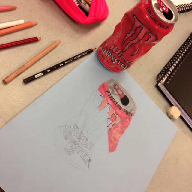
We learned how to mix and blend HUES, TINTS and SHADES using Prismacolor pencils. This helps to create VALUE when shading.
Then, students had to choose between a MONOCHROMATIC or COMPLEMENTARY color scheme to complete their drawing.
A monochromatic color scheme uses tints and shades of one color. For example, if a student chose blue paper, their drawing would be done in all values of blues.
A complementary color scheme is two colors across from each other on the color wheel (opposites). For this example, students who chose a blue paper, would complete their drawing in all values of oranges.
When turning this project in for a grade, students were asked as part of their self assessment, to explain how they used symbolism to represent themselves in their artwork. Hopefully, this process will begin to have them think about using symbolism when planning future artwork.
Here are some student examples. See if you can determine which color scheme was chosen in each piece.
Tuesday, September 27, 2016
Kluender- Computer Art 7/8
Computer Art student's Power Word Kaleidoscopes are coming out awesome! We're adding lots of color and shading to them.
We also discussed parts 2 & 3 of our Digital Photo Kaleidoscope project today. Students are always very excited when it's their turn to get on the computer to work!
Can't wait to see how their artwork comes together! :)
Subscribe to:
Posts (Atom)